Combo Deals for Camile
Create a combo deals section to improve customer retention and increase revenue
Design
Almas Bismi
Type
Redesign
Year
2024
Overview
Customers perceived Camile to be expensive compared to takeaways/ restaurants in similar categories. This is a case study on the research, design rounds and validation done to improve customer sentiment.
Research +
Overview
Camile Thai is positioned as a premium takeaway brand. However, customer feedback revealed a growing perception that Camile was expensive compared to similar takeaway options, negatively impacting order frequency and retention.
This case study covers the research, design iterations, and validation behind introducing combo meal deals to improve perceived value without compromising the brand’s premium positioning.
Problem
User problem:
Customers struggled to:
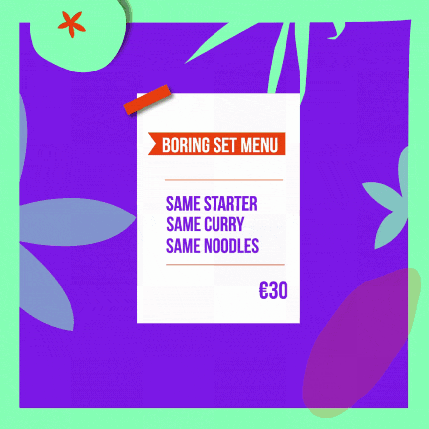
- Perceive value when ordering individual items
- Discover fragmented and easy-to-miss discounts
- Avoid defaulting to single-item purchases due to complexity
Business problem:
- Lower repeat purchase frequency
- Missed opportunity to increase average order value
- Risk of being perceived as an occasional luxury rather than an accessible treat
Goals & Success Criteria
Business goals:
- Improve value perception without diluting the premium brand
- Increase baseline revenue and customer retention
- Encourage customers to order multiple items per session
UX goals:
- Make deals easy to discover
- Clearly communicate savings
- Reduce effort required to build a “value” order
Research & Insights
Initial focus groups with both new and returning customers revealed a consistent insight: Camile was perceived as more expensive than comparable takeaways, even when discounts were available.
Key findings:
- Customers were unaware of existing deals
- Discounts applied to individual items didn’t communicate “value” effectively
- Users rarely explored beyond the main menu
Process +
My Role
I led the UX and UI design for the meal deals experience, working closely with internal stakeholders and engineering. My responsibilities included:
- Translating research insights into product opportunities
- Designing and iterating on the deals discovery experience
- Missed opportunity to increase average order value
- Risk of Camile being perceived as an occasional luxury rather than an accessible treat
Solution Strategy
The business decision was to introduce combo meal deals, allowing customers to bundle commonly purchased items together for a clear discount. The design challenge was ensuring that:
- Deals were visible
- Savings were immediately understandable
- The experience still felt premium, not promotional or cluttered
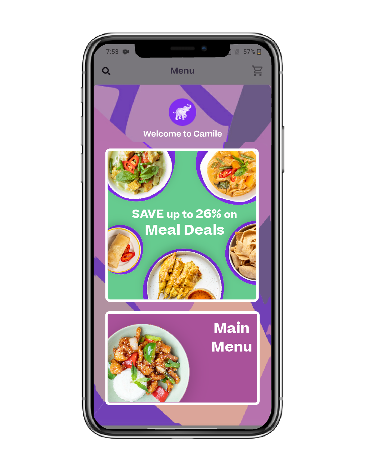
Design Iteration 1: Dedicated Meal Deals Page
A new Meal Deals tab was added to the menu, housing curated bundles based on sales data of frequently paired items. Each deal included:
- Custom UI and graphics
- Clear pricing and savings
- A visual hierarchy aligned with Camile’s premium brand
Outcome
Usability testing revealed a major issue. Users rarely noticed the tab and continued ordering from the main menu.
Design Iteration 2: Improving Discoverability
Based on usability feedback and sales behaviour, the focus shifted from structure to visibility:
- Data-informed curation: Sales data was used to create a refined list of high-intent meal combinations, reducing choice overload.
- Visual emphasis: Each deal was treated as a first-class product, with dedicated visuals and clear value communication.
- Implementation: All UI designs, assets, and specifications were shared with engineering to support rollout.
A/B Testing: Driving Awareness
To increase traffic to the meal deals, two approaches were tested:
- Idea 1: A subtle text banner on the menu page directing users to the Meal Deals section.
- Idea 2: A prominent pop-up highlighting deal availability and potential savings compared to individual items.
Result
Idea 2 significantly outperformed Idea 1, driving higher awareness and engagement with meal deals.
Outcomes +
Results
Despite launching a dedicated meal deals page, early results showed that discoverability remained the biggest challenge. Users continued to default to the main menu unless prompted. Key outcomes:
- Visibility mattered more than information architecture alone
- Value needed to be communicated at the right moment in the user journey
- Data-driven bundles reduced friction and decision fatigue
These insights informed ongoing iterations to integrate deals more seamlessly into the core ordering flow.