Locations Page
Improve UI/UX of Camile Thai's locations page based on customer feedback.
Design
Almas Bismi
Type
Design/ Redesign
Year
2024
Overview
Camile’s users reported difficulty finding information about Camile restaurants near them. They were looking for info such as where the location has a dine in experience or whether it was just a takeaway. Some even reported that they wanted an easier way to check all nearby locations.
Research +
Overview
Camile Customers reported ongoing difficulty finding relevant information about nearby Camile Thai restaurants. Common questions, such as whether a location offered dine-in or takeaway, or which restaurant was closest, required unnecessary effort to answer.
This case study explores how the locations experience was redesigned to reduce friction, improve clarity, and help users move from discovery to action more efficiently.
Problem
User problem:
Users struggled to:
- Identify nearby locations quickly
- Understand what services were available at each restaurant
- Move between locations without restarting their journey
Business problem:
- Friction in location discovery delayed ordering and reservations
- Key actions were not clearly surfaced, reducing conversion
- Poor hierarchy weakened clarity across the locations experience
Goals & Success Criteria
- Enable fast, intuitive location discovery
- Clearly differentiate dine-in and takeaway locations
- Reduce navigation and cognitive load
Research & Insights
Customer feedback showed that users approached the locations experience with a task-driven mindset. Key insights:
- Users wanted to compare nearby locations at a glance
- Primary actions were easy to miss due to weak hierarchy
- Switching between locations felt slow and disruptive
Process +
My Role
I led the UX and UI design improvements for the locations experience, translating customer feedback into clearer flows, stronger hierarchy, and more consistent components across pages.
Solution Strategy
The strategy focused on removing friction at key decision points by:
- Improving discovery through search and maps
- Making primary actions immediately visible
- Allowing users to switch locations without leaving the current context
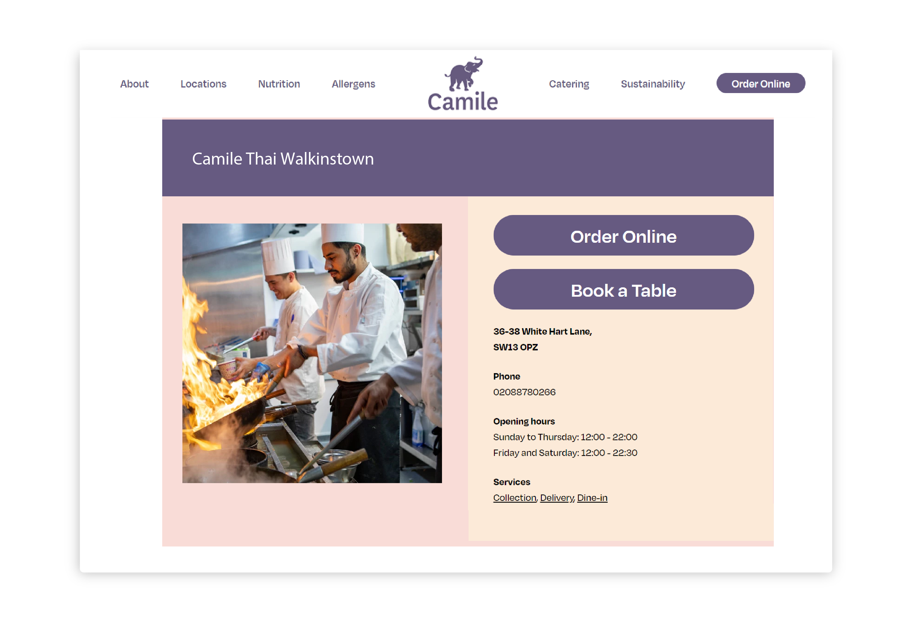
Location List Page: Key Improvements
- Introduced a search bar to quickly find specific locations
- Added a map view to help users visually identify nearby restaurants
- Placed primary calls to action (Order Online, Book Table) directly alongside each location
- Standardised the search component across location pages for consistency
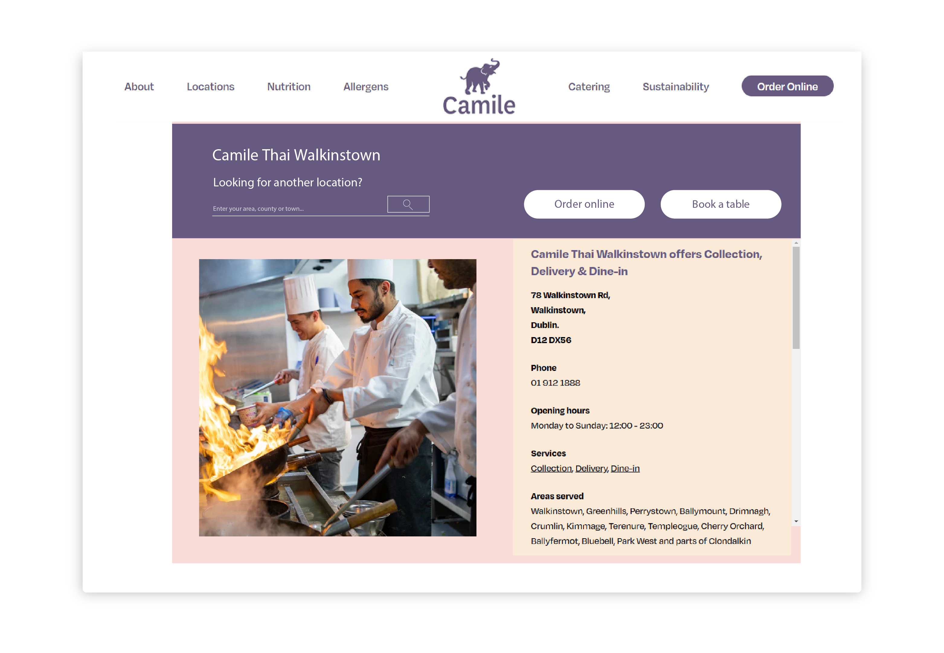
Location Landing Page: Iteration
Before: Users had to return to the full list to switch locations; weak hierarchy made information harder to scan.
After: The redesigned location page prioritised clarity and continuity:
- Added an in-page search to explore nearby locations without leaving the page
- Enabled quick switching to the closest alternative location
- Grouped primary actions into a single, clearly defined component
- Improved layout hierarchy to make key information easier to scan
Outcomes +
Results
The updated locations experience made it easier for users to:
- Find nearby Camile restaurants quickly
- Understand available dining options at a glance
- Take action with greater confidence
Key outcomes:
- Clearer prioritisation of primary actions
- Reduced friction when switching between locations
- Stronger alignment with user intent
Learnings
This project reinforced that location discovery is a decision-making flow, not a content page. Clear hierarchy, consistent components, and in-context search significantly improve usability — especially during high-intent moments such as ordering or booking.
Before
After
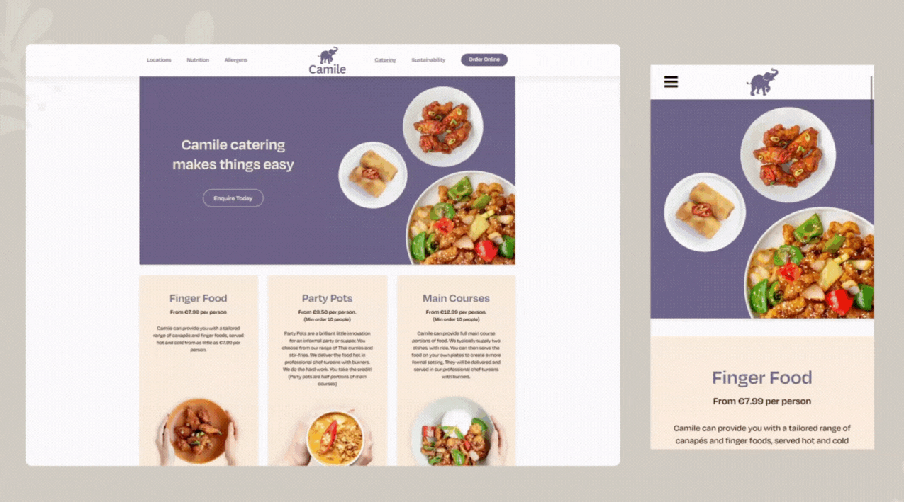
Catering Page
Create a page to inform customers about the catering service.
Design
Almas Bismi
Type
Design
Year
2024
Overview
A simple static UI page with animations to grab users' attention and market the catering service.