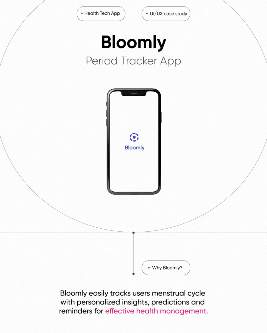
Bloomly period tracking app
Period-tracking experience reframed to reduce friction + increase retention
Design
Almas Bismi
Type
Case Study
Role
Product Designer
Year
2024
Overview
Bloomly is a period-tracking app reimagined to make cycle management simple, approachable, and predictive. Unlike many menstrual health apps that overwhelm users with excessive features and clinical language, Bloomly was designed to reduce friction in daily tracking while fostering long-term consistency. The project centered around two key goals: building a streamlined experience that encourages sustainable tracking habits, and delivering personalized insights that feel both accurate and empowering.
Research +
What are the challenges users face when tracking their periods?
+ Desk research + Benchmark + User interviews + Surveys
Benchmarking and desk research reveal that users value simplicity and predictive insights in period tracking apps. While many prefer a clean and minimal interface, features such as reminders and forecasting are carefully considered to improve consistency and planning.

The real question... How might we improve the make the period tracking process easier for the user?
Ideation +
User Journey
When mapping the experience of using period tracking apps, we found motivation peaks at discovery but quickly drops during onboarding due to overwhelming features. The lowest point occurs during daily logging, where users forget or lose interest, creating data gaps. Bloomly addresses this by offering a secure personalized setup, simple logging screens, and gentle reminders, turning friction points into moments of trust, ease, and consistent engagement.
The Challenge
Most period tracking apps today try to do too much offering countless
features, dense data, and complex navigation. Through research, it
became clear that many users simply wanted a way to track their cycles
easily, feel secure with their data, and stay consistent without being
overwhelmed.
However, users often forget to log their periods or lose motivation over time,
leading to inaccurate insights and a gradual drop in engagement. The challenge
was to create a new kind of period tracking experience one that feels simple,
private, and genuinely supportive, helping users build consistent habits effortlessly.
Proposed Solution
The proposed solution was to design a period tracking app built around
trust, simplicity, and consistency. Bloomly focuses on making the
tracking process intuitive and secure from the very first interaction:
Privacy-first onboarding: Users can sign up using fingerprint authentication
or their preferred method (Google, Apple, Facebook, or email), ensuring flexibility
and security.
Personalized setup: Short, thoughtful onboarding questions tailor the app
experience to the user’s lifestyle and cycle patterns.
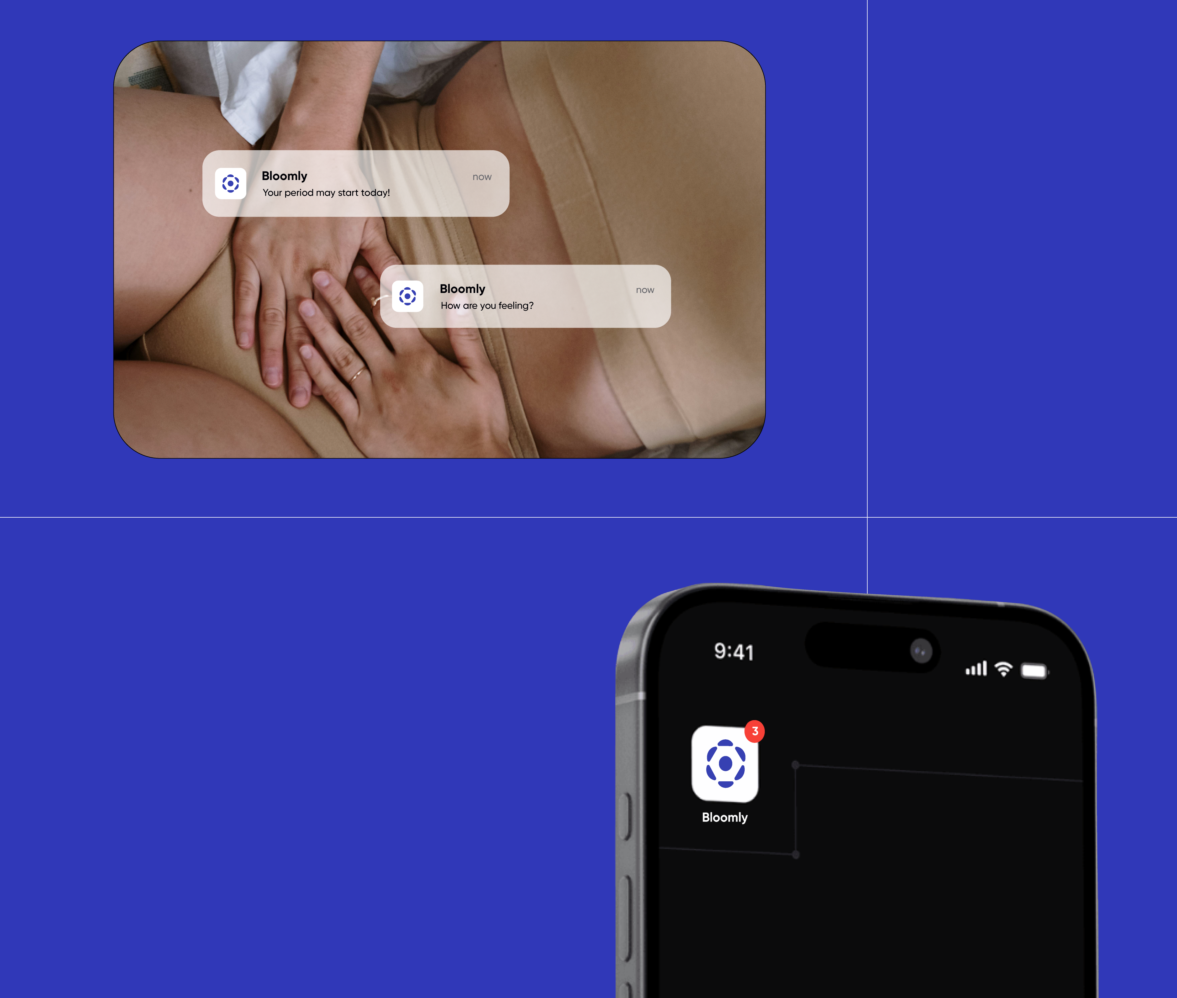
Effortless daily tracking: Users receive a gentle notification to log the
day’s data. Tapping it opens directly to a clean, focused logging screen reducing
steps and friction.
Calm, focused home screen: A minimal home interface highlights only essential
information, like cycle predictions and gentle reminders, avoiding information
overload.
Bloomly’s goal is to make period tracking feel less like a chore and more
like a small, empowering daily ritual. The design encourages consistent use
through clarity, comfort, and respect for user privacy.
Moving Research to Design
Insight #1
Users regularly track their menstrual cycles and prefer simplicity over complexity. However, many existing apps overwhelm users with too many features, which leads them to abandon the app in favor of simpler alternatives.
Insight #2
Many users struggle to remember to log their periods consistently,
leading to gaps in their data and less accurate predictions over time.
How we approached it
To encourage consistency, Bloomly integrates gentle, timely notifications
that remind users to log their data without overwhelming them. When a user
taps a notification, they’re taken directly to the logging screen, allowing
for quick, frictionless input. This small design decision helps transform
tracking into a seamless daily habit.
Insight #3
While users appreciate notifications and insights, they often feel
overwhelmed by too much information and frequent alerts.
How we approached it
During the personalized setup, users can adjust how often they want to receive
notifications, giving them control from the start. Bloomly’s home screen highlights
only key insights such as upcoming cycle predictions and gentle reminders,
maintaining a calm and focused experience. Notifications are adaptive to user
behavior, ensuring they remain timely, relevant, and supportive rather than
intrusive.
Testing +
User Journey
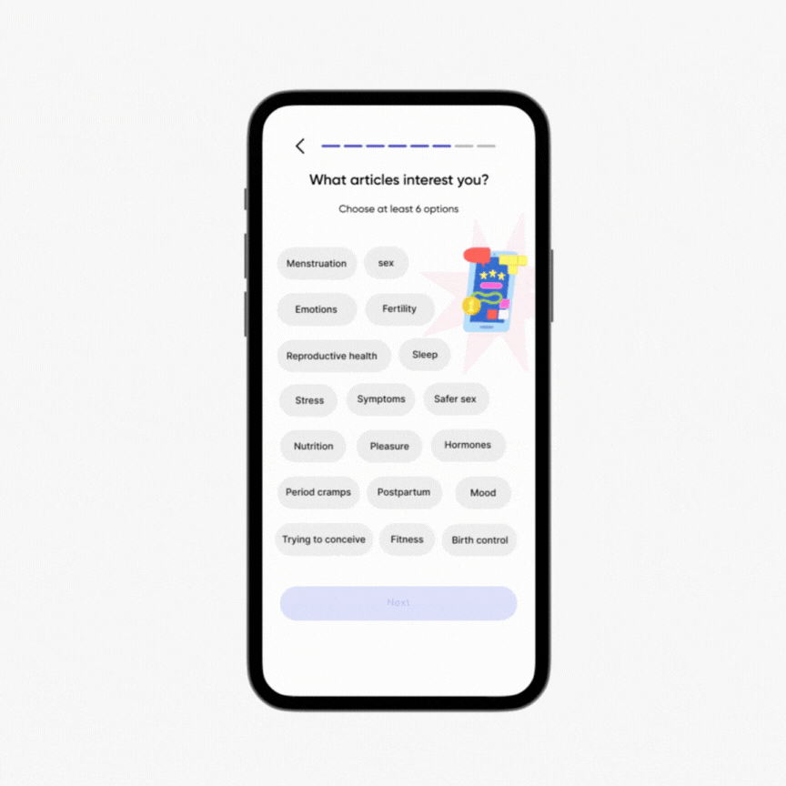
We asked participants to complete different scenarios and observed their behaviors while interacting with the prototype. During testing, users felt uncertain about how long the personalized setup would take, as there was no clear indicator of progress. This caused frustration and a sense of being overwhelmed. In response, we added a progress tracker at the top of the screen to show completion status, helping users feel more in control and reducing cognitive load throughout the setup process.
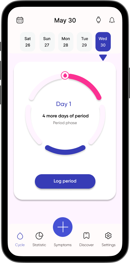
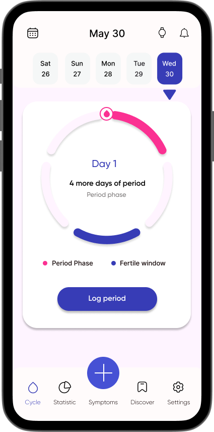
During testing, users were asked to log their period using the home screen. Many were unsure what the blue and pink sections of the cycle wheel represented, causing confusion about how to interpret their data. To improve clarity, we added labels below the wheel explaining what each color denotes. At this stage, only the current phase and fertile window colors are displayed, while other phases remain disabled to keep the interface simple and focused. This change helped users quickly understand their cycle stage and made the experience feel more intuitive.
Learnings +
Start with what feels real
Working on Bloomly reminded me that meaningful design often begins with something familiar. Period tracking is a daily habit for many, yet it can easily become overwhelming when the experience feels cluttered or impersonal. Instead of reinventing it, I focused on making it feel lighter, calmer, and more intuitive.
Small things matter more than we think
Adding a progress tracker, clarifying color meanings, or letting users adjust their notification frequency might seem like small decisions, but these moments build trust. Seeing how these refinements reduced confusion and helped users feel more at ease reinforced my belief that thoughtful details create the strongest connections.
Designing for comfort, not control
Throughout this project, I learned that designing for menstrual health is really about designing for comfort. Users don’t want to be managed they want to feel supported. A calm interface, gentle reminders, and flexible personalization can turn something routine into something reassuring.
Simplicity is empathy in practice
This project deepened my understanding that simplicity isn’t about removing complexity—it’s about intention. When each interaction feels considerate and human, users feel seen. And that, more than anything, is what good design should do.